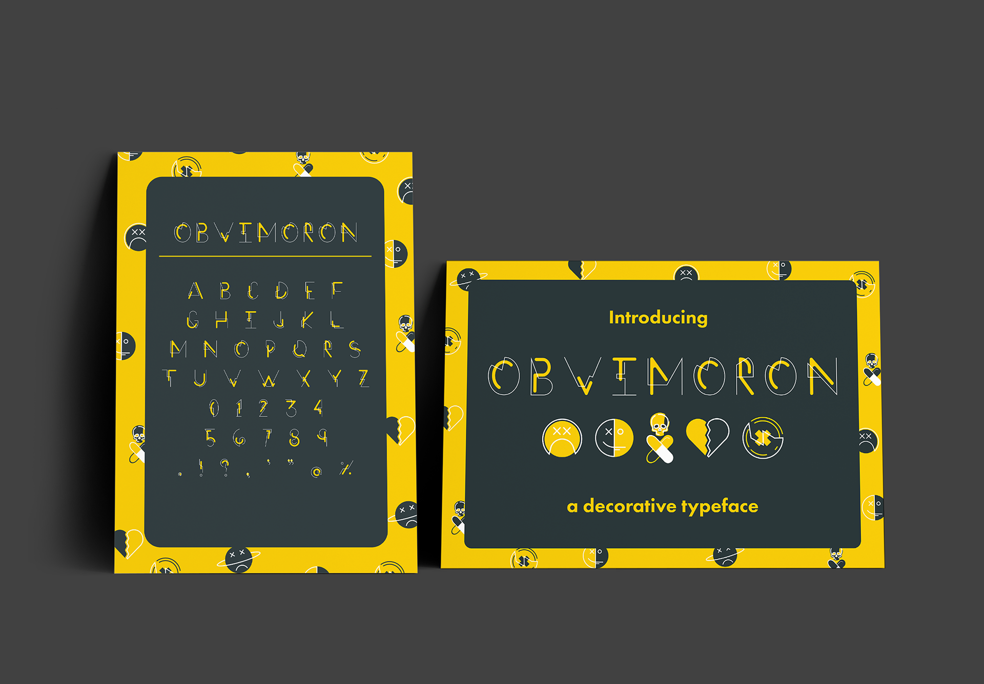

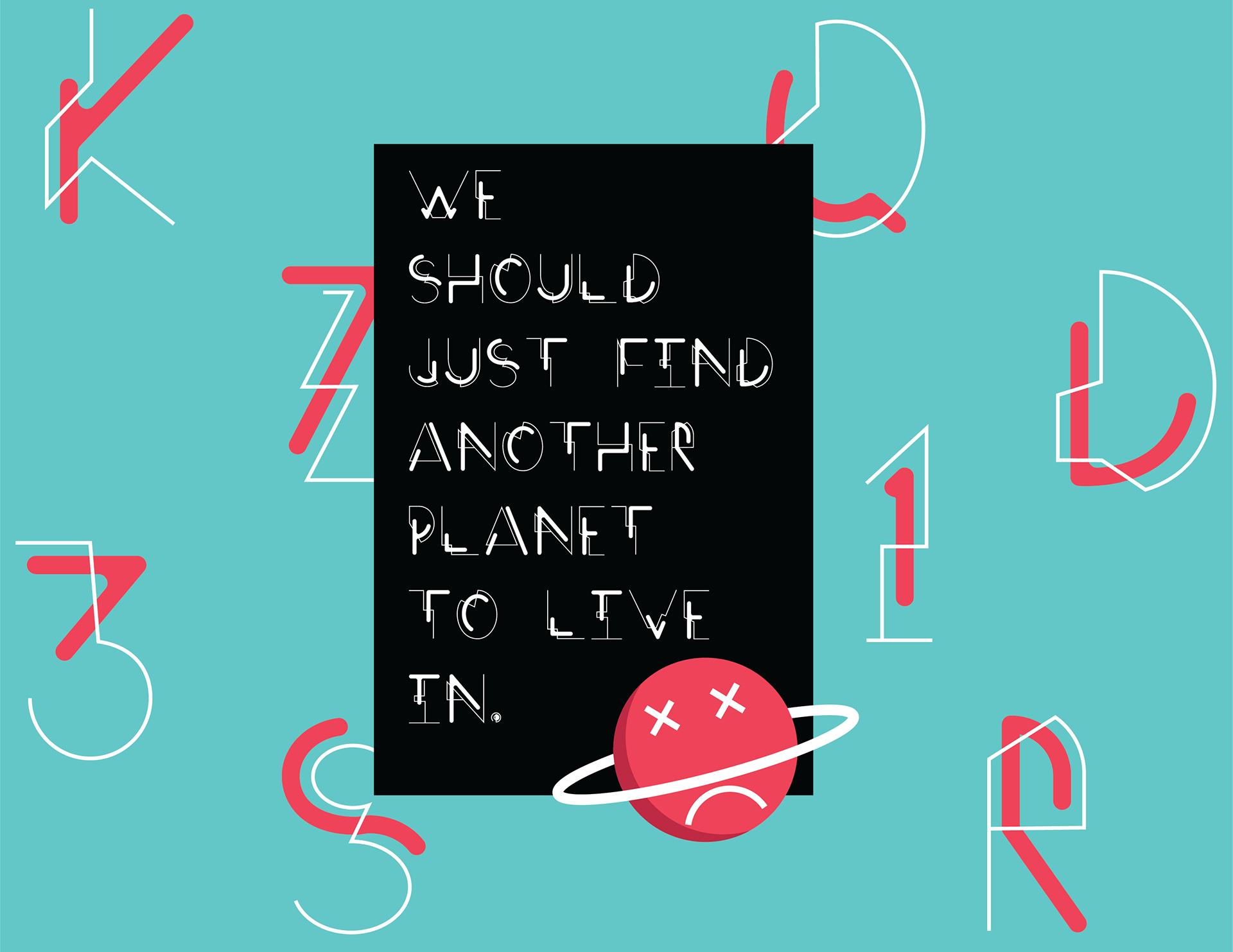
One of my Projects on my Advance Typography Class. We were tasked to create our own typeface that is integrated from a place that we either feel positively or negatively about. I chose a previous work place that reminds me of unpleasant memories that gave off a very lethargic and weary vibe. I decided to use a vibrant vibe on the typeface showing the opposite feeling of the place. From unpleasantry to artistry! I chose the name "Obvimoron" (a word play to oxymoron) signifying the opposition between the vibes that the chosen place and the typeface gives off.